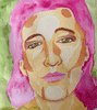
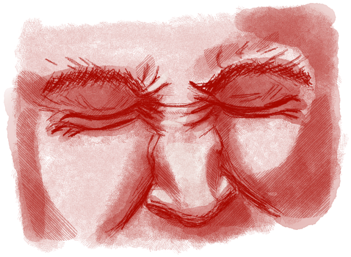
This is my second digitally painted portrait on the iPad Pro. I am currently focussing on facial expressions, this one shows anxiety. I edited this image to create a dark shadow around her head (which was previously a bright yellow.) It’s amazing how colour affects emotions and the reading of an artwork.
I did use a blue background which I also incorporated into the skin tones of my subject, this I feel definitely adds successfully to the emotional reading of the piece. I’d love to hear your comments and feedback. 🙂
I am the proud new owner of an iPad Pro and Apple pencil. What incredible tools for an artist, especially paired with the ProCreate App!
In this digital portrait I tried to create a painterly style with soft edges and visible brush strokes. I am also experimenting with colour as an emotional trigger. My current (uni) project is about emotion as visible on facial expressions.
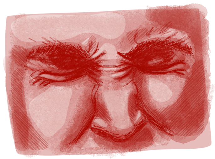
What I really like about this painting is how the green background ‘bleeds’ through into the skin tones. If I were painting this in traditional media I’d start with a green background so that it would show thorough areas of my painted canvas.
I’ll update my Portraiture Project as soon as I have more to post. Thanks for reading! 🙂
If there is one single ‘truth’ in art it is that Practice is King. Since I’ve been taking my iPad with me wherever I go I have had many opportunities to practice my drawing without being too obvious about it. People get self-conscious when they know you are sketching them.
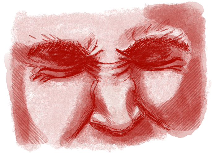
At our monthly portrait group meet up on Sunday I was grateful for the opportunity to capture facial expressions. My iPad drawings are rough, just quick planning sketches, some of which will become traditional oil paintings. I love the freedom that these quick sketches give me to not be too precious about the outcome and to have a source of inspiration to develop a larger or more complex work from later.
I use a rubber-tipped stylus and a drawing App called ‘Sketches’, unfortunately my iPad is too old for newer drawing Apps like Procreate; but the App that I use serves my purposes well enough.
That’s my drawing tip for today. Thanks for visiting. 🙂
I am happy to announce the return of our Artist Interviews. The first series was popular with readers, I am certain the 2nd series will be too.
In this first interview of the new series I’d like to extend a warm welcome to American artist Thomas LaBadia. Tom’s paintings have mesmerised me and I was understandably thrilled that he agreed to be interviewed on the site. This in-depth interview is jam-packed with many of his beautiful artworks. Enjoy!
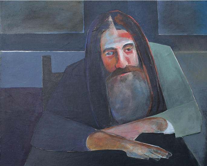
Nostradamus. 2018. Mixed Media: Acrylic Paint, Black/White Charcol over collage. Size: 24 x 20
Who are you and what do you do? I am Thomas LaBadia, I am an art director, graphic/web designer and a mixed media artist.
Why do you do what you do? I have been creative my entire life, so it was natural for me to pursue a career as a graphic designer. A few years ago, I decided I wanted to try more traditional ways of creating.Although I was a digital artist for several years, I felt that I wanted to step away from the computer and work with my hands.
How do you work? I find that working intuitively is what works best for me. I allow my paintings to be what they want to be. Although I often start out with an idea, or begin by following a lesson plan of some kind, I find that I am most successful when I allow the painting to guide me.
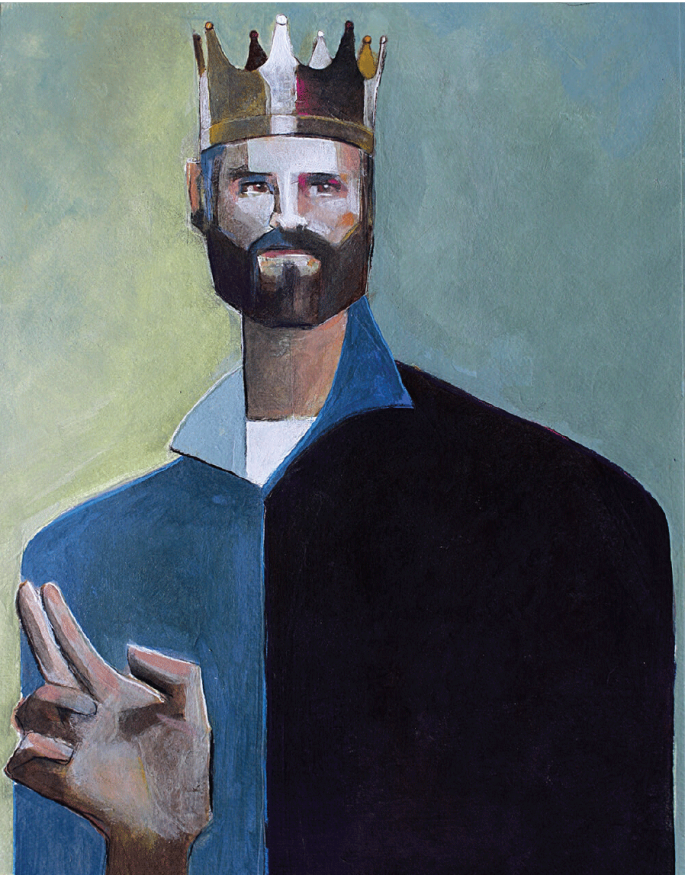
King For A Day. 2018. Mixed Media: Acrylic Paint, charcoal and Pastel pencil. Size: 18 x 20
What’s your background? I have been a graphic artist for over 20 years and I have lived in South Florida for almost 30 years. Prior to that I was a hairdresser and a salon owner in a small upstate NY town.
What’s integral to the work of an artist? Authenticity to me is necessary if an artist wants to create work that is original and personal. Although I think it is also important to study the work of other artists, I think the goal is to use what you learn in your own unique way and not to copy someone else’s style or identity.
What role does the artist have in society? I think that most things in life include art in some way. I think a visual artist can connect people who would otherwise be disconnected, and connection is always a positive thing.
The Truth is a Beautiful Thing. 2017. Mixed Media: Collage, Colored Pencil, Acrylic Ink, Pen. Size: 20 x 20
What has been a seminal experience?
A few months ago I was at a local gallery where I ran in to an artist I had taken private lessons with for several months. He is a highly skilled portrait artist and his work is very photorealistic. Although it was never my intention to create photorealistic portraits, I have always admired his amazing technical skills. As we were both staring at an extremely expressive, technically ‘off’ portrait that was the furthest thing from photorealistic, he turned to me and said “I wish I could paint like that, but when I try I just can’t stop myself from going back and ‘fixing everything. I just can’t do it and wish I could.”
It was then I realized that being able to work expressively was also a skill and that creating picture perfect portraits was maybe not as important to me as it once was.
Untitled: Portrait Study. 2018. Acrylic. Size: 10 x 12
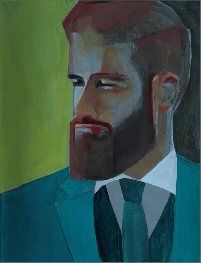
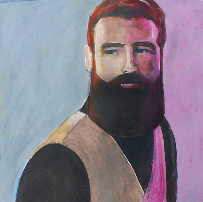
Explain what you do in 100 words At the present time I am working exclusively on mixed media portraits, mostly of men with beards. Although I work in a variety of mediums, I am mostly starting my portraits in acrylic and finishing them in charcoal or pastel pencil.
How has your practice changed over time Although I painted often as a child, as an adult it was like starting over. There is so much to learn when you are just starting out. Not only are you missing the technical skills you need to accomplish what you want, you are also learning how to use art supplies properly at the same time. When I first reintroduced art practice to my life, I was not focused and had no direction whatsoever. I was easily intoxicated by the next great class or art supply I wanted to master and as a result I did not grow as fast as I have this last year when I decided to focus exclusively on portraits. I think artists tend to be easily distracted (I know I am.) I would say that is what has changed the most, forcing myself to stay focused on one thing at a time and avoiding distractions.
I also tend to use rather subdued colors now. In the beginning I was really into super bright colors. I don’t find that I do much of that any more.
Untitled: Portrait Study. 2018. Acrylic Paint. Size: 20 x 20
What art do you most identify with? For sure it would be expressive portraits. I love everything about them.
What work do you most enjoy doing? I love painting men with beards. I think what I love most about beards is how they can transform the look of someone’s face. There are so many styles and shapes that give the face an added dimension.
What themes do you pursue? Men with beards.
Untitled: Portrait Study. 2018. Mixed Media: White/Black Gesso, Acrylic and Charcoal. Size: 15 x 20
What’s your favourite art work? I love any of Andrew Salgado’s portraits. His work is so unique and so expressive.
Describe a real-life situation that inspired you? Last year I went on a mini-vacation to New Orleans. Although I met friends and we spent a couple of days together, I had a few days by myself to explore. I spent that time in the French Quarter exploring many of the amazing galleries and meeting artists. Although I was already familiar with the work of David Harouni, seeing it in person really inspired me. I think it is impossible to really experience art the same way on a computer screen. I know that even with my own work, I find it impossible to take photos that show off the color and texture as one might experience the piece in person.
When I got to meet David and see his work in person, I was mesmerized by his use of texture, color and the SIZE of his paintings. My appreciation of his work quadrupled just by walking into his gallery and seeing his work in person.
Untitled: Portrait Study. 2018. Charcoal Drawing. Size: 18 x 20
Why art? For me art is like eating and breathing. When I am not working on art I am thinking about working on art. It is just a part of who I am and always has been for as long as I can remember.
What is an artistic outlook on life? I feel like being an artist is a gigantic gift that I greatly appreciate. Seeing life through the eyes of an artist is almost indescribable because you see so many things that other people don’t ever notice. The way the light shines on something, the textures in nature, how two unrelated objects look together. The possibilities are endless, and art is a part of every moment of every day in some way.
What memorable responses have you had to your work? I recently worked on a piece that was not very well received at home. As you know art is so subjective and while I don’t anticipate everyone falling in love with everything I do, there are pieces that I personally like more then others. Although I loved the piece I am speaking of, I almost didn’t share it because of the extreme negative reaction it received at home. I decided that I would risk sharing it anyway and it was the first time I had four different people approach me, asking if they could buy it. At this point I don’t really sell my art, but it did open me up to the possibility that one day perhaps I might consider it.
The Forgotten Superheroes. 2018. Mixed Media: Collage, White/Black Gesso, Colored Pencil, Acrylic Ink. Size: 20 x 20
Is the artistic life lonely? What do you do to counteract it? I am probably the wrong one to ask. I LOVE being alone. I am happiest when I am in my home, playing music and working on art. I don’t ever want it to end.
What do you dislike about the art world? I can’t think of anything I don’t like, but I am not actively involved in the art world. I have a few close friends who are artists and I like the online communities I participate in, but other then visiting galleries, I can’t say the art world is a part of my daily life.
What do you dislike about your work? I wish I could be more accurate and that I could be more successful with hands.
What do you like about your work? I like that my work has a style of its own that people seem to recognize right away.
Untitled: Portrait Study. 2018. Mixed Media: Acrylic and Pastel Pencil. Size: 20 x 24
Should art be funded? Absolutely.
What role does arts funding have? They say that children who participate in art are 4 times more likely to be recognized for academic achievement than those who don’t and that early exposure to the arts sharpen minds and creativity. For this reason alone, it is important to fund the arts.
What research to you do?
Other then researching reference photos as a starting point and attending online workshops to learn the ‘how’ part of how to achieve a painting, I can’t say I do a ton of research.
What is your dream project? The one that I am working on at the moment.
Name three artists you’d like to be compared to. I would rather be known for my own style, than to be compared to someone else.
Untitled: Portrait Study. 2018. Mixed Media: Acrylic and Pastel Pencil. Size: 20 x 24
Favourite or most inspirational place Asheville, North Carolina where I hope to one day retire and live.
What’s the best piece of advice you’ve been given? I have always loved this quote by Ira Glass. When I first read it, it really resonated with me.
“Nobody tells this to people who are beginners, I wish someone told me. All of us who do creative work, we get into it because we have good taste. But there is this gap. For the first couple years you make stuff, it’s just not that good. It’s trying to be good, it has potential, but it’s not. But your taste, the thing that got you into the game, is still killer. And your taste is why your work disappoints you. A lot of people never get past this phase, they quit. Most people I know who do interesting, creative work went through years of this. We know our work doesn’t have this special thing that we want it to have. We all go through this. And if you are just starting out or you are still in this phase, you gotta know its normal and the most important thing you can do is do a lot of work. Put yourself on a deadline so that every week you will finish one story. It is only by going through a volume of work that you will close that gap, and your work will be as good as your ambitions. And I took longer to figure out how to do this than anyone I’ve ever met. It’s gonna take awhile. It’s normal to take awhile. You’ve just gotta fight your way through.”
Professionally, what’s your goal? I am very lucky. I have already achieved my professional goals. I love being an art director and can’t imagine every wanting to do anything else. My paintings I do for myself and have never had an interest in doing things to sell. Although lately I have realized that I may need to sell my work, just to make room in the house. It is starting to take up a lot of room that I don’t have 😊
What wouldn’t you do without? Art – of course and maybe coffee. 😊
If you’d like to connect with Thomas to see more of his inspirational work you can reach him via his Facebook Profile.
Learning to draw can take years of practice, knowing some basic drawing techniques however will help to render accurate drawings in less time. In this post I will share another effective drawing technique that even new artists can practice with good results. Be sure to check out the Top Down Drawing Technique that I shared recently too. The source image for today’s drawing is from Gary Faigan’s book The Artist’s Complete Guide to Facial Expression. Today I am attempting to depict pain as expressed on the face.
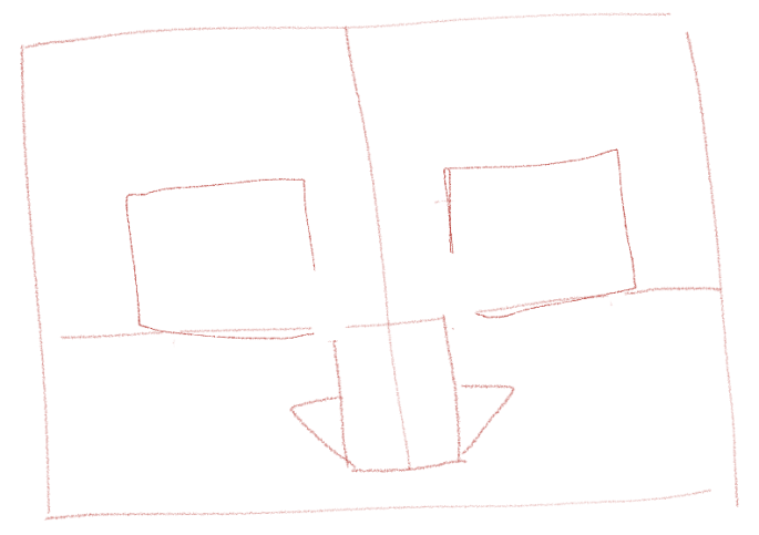
The first step is to reduce your subject (or object) to basic shapes as shown below. A nose, for example, becomes a rectangle with small triangles on either side. The eyes are mapped in with two simple squares.
Using these basic shapes as guides we then start adding more detailed lines, always trying to keep the elements proportional to one another, taking into consideration how wide the eyes are in relation to the nose, how far apart etc.
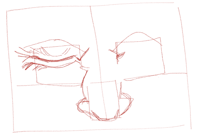
Once we’re happy with the placement of our elements we should spend some time refining the drawing, erasing where needed to make corrections or using heavier lines where appropriate as seen below. Shading consists of 3 parts, mid tone, darker tones and highlights. Shading is necessary to create a 3D effect. In the image below I have added my mid tone (and just started plotting out my darker tones.)
The next step is to create definition by focussing on the darker tones. Here I used hatching to define the darker areas.
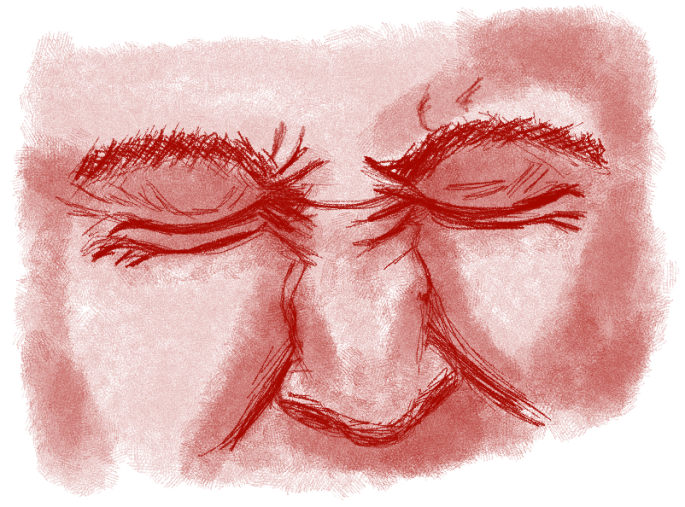
I wanted more depth so added darker tones below.
The eyes needed to be darker yet which I corrected below.
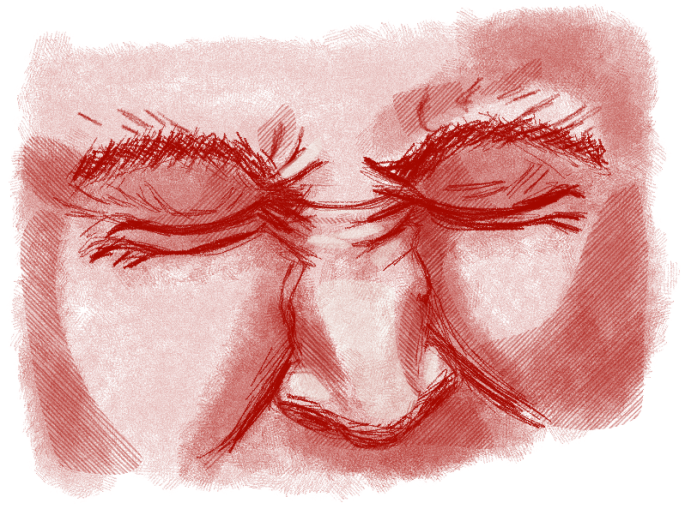
Now all that is left to do is to add highlights. This creates the illusion that lighter areas are protruding from the face (whereas darker areas are receding.)
I did this drawing on the iPad while researching facial expressions for my portraiture project. The convenience of iPad drawing suits me when I want to do a quick study like this example.
One thing we will never be able to avoid if we hope to improve our drawings is to draw as often as possible, every day if we can.
Give this technique a try and let me know how it works for you. Until next time, happy drawing!
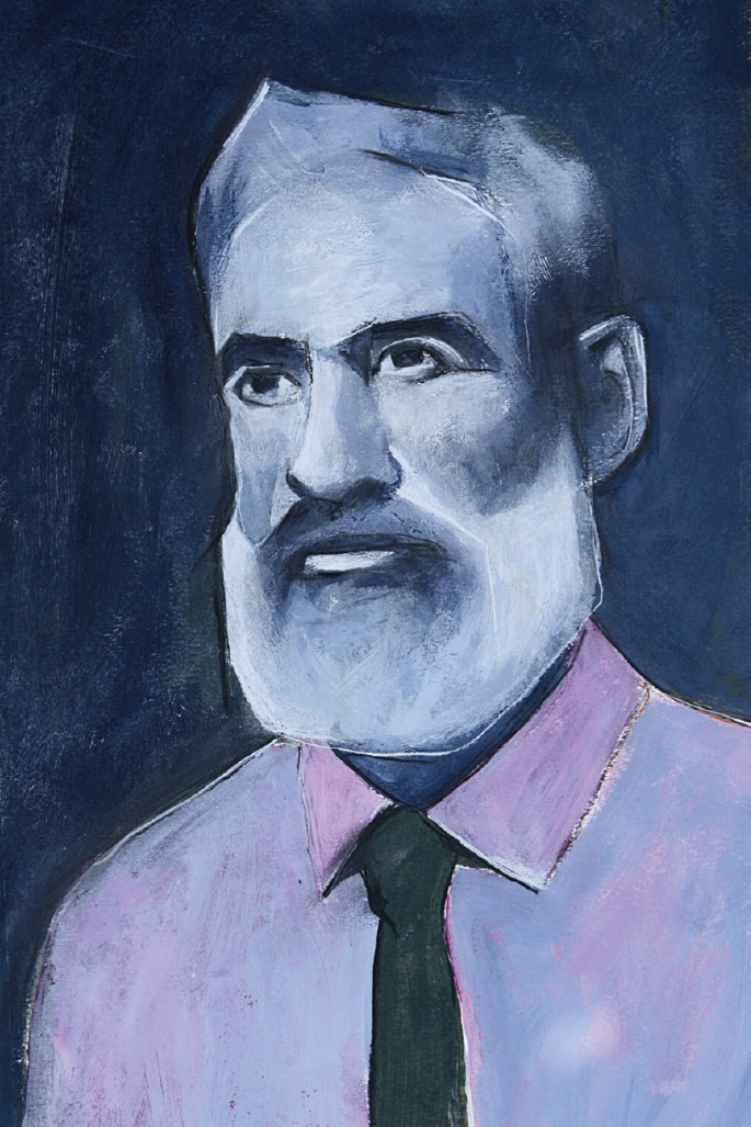
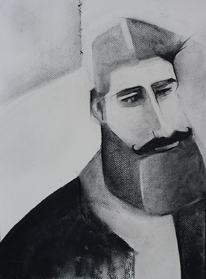
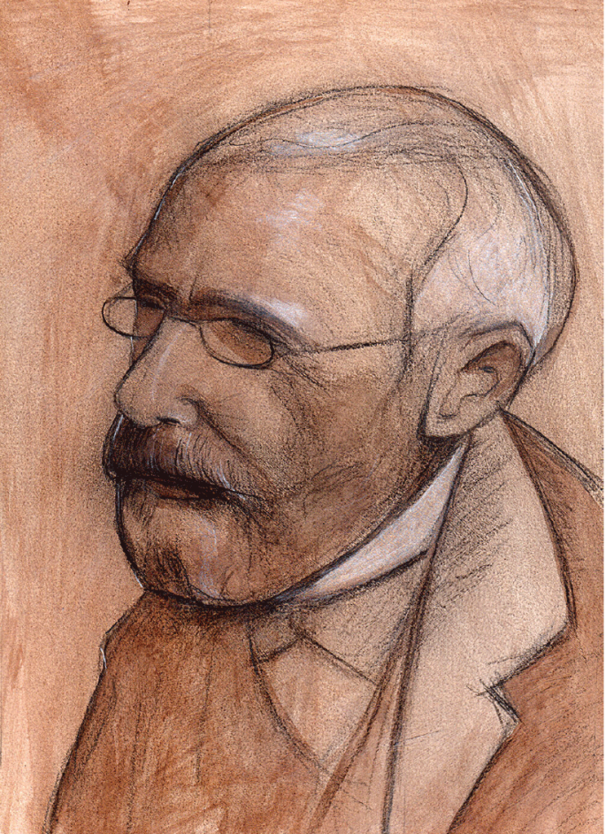
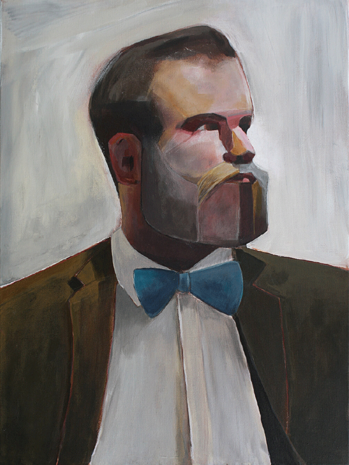
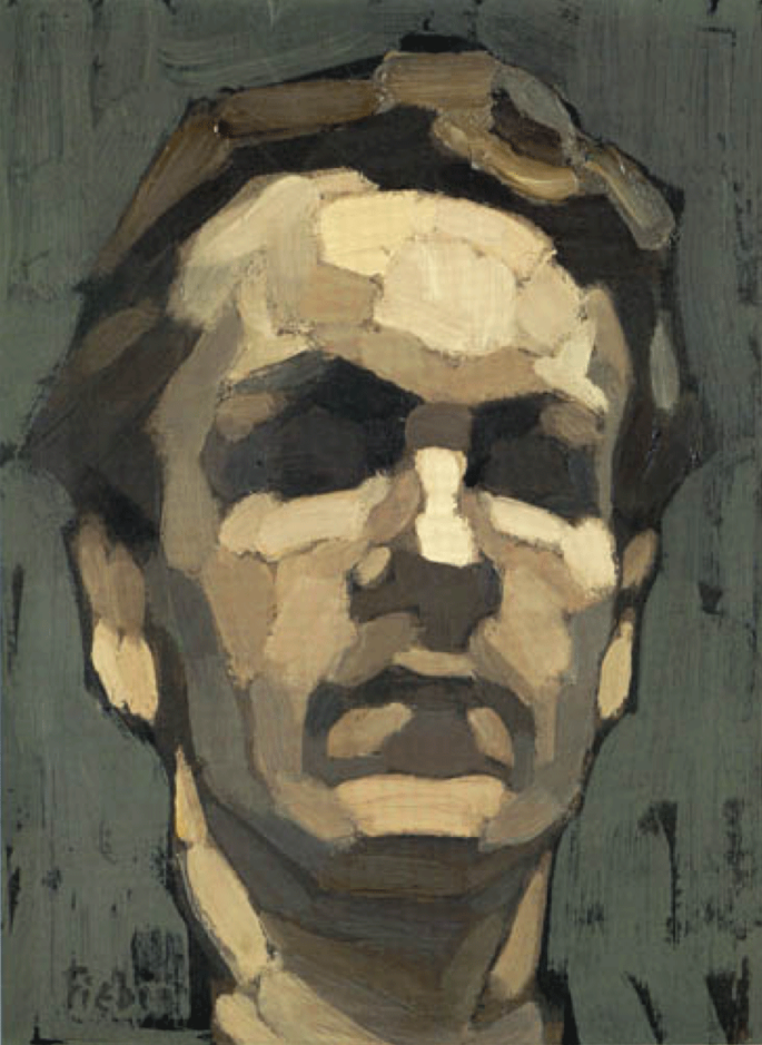
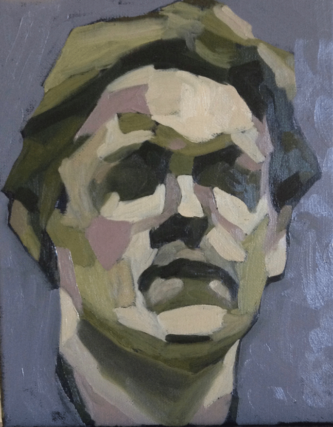
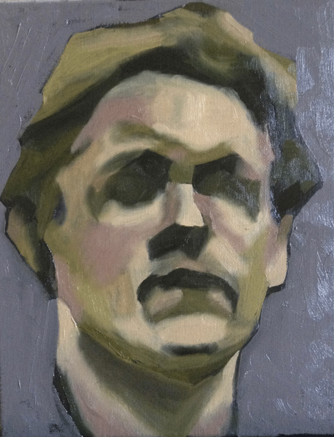
Today I did a study of Frederic Fiebig‘s 1905 Self Portrait, primarily because I am currently interested in facial planes on my portrait painting journey. I did not try to replicate his palette (and still have lots to learn on colour mixing) so the colours are different.
I ended up with a sharp-edged result, (much like his) which I then proceeded to soften. I think that was probably a mistake, but hey I am engaging in experimentation so all is not lost. Which version do you prefer? I think I prefer the hard-edged one.
I prepared my small canvas with black gesso before applying oil paints. Working on a non-white ground really does create a different effect and also helps to eliminate the ‘white canvas intimidation’ that so many of us face.
A copy of Fiebig’s 1905 painting directly below:
Frederic Fiebig. 1905. Self Portrait. Oil on cardboard.
My hard-edged version below:
And my soft-edged version:
Anndelize Graf. 2018. Fiebig Study. Oil on canvas. 8 x 10 inches.
Thanks for joining me on my portrait painting journey. I hope you will return soon to see what I attempt next as I work at improving my portraiture skills.
I am new to portraiture. Most beginners will agree that it is a daunting and intimidating task. My first step toward portrait painting was to do a study of the facial planes based on a plastic head model in my studio, using oils on canvas. There is much room for improvement and I will need to practice a lot more before I’m totally satisfied with the results, but it’s a good start.
Facial planes are important because they are the building-block of shading, they help to determine where highlights and shadows go on the face to create a 3D effect rather than a flat painting. Different lighting effects will cause some facial planes to recede into shadow while others are highlighted, these change as the lighting and viewer angle is changed.
Like most things portraiture does not exist in a vacuum, there are many things to consider, not least of all how to accurately draw the face before painting it. One way is the Top Down Drawing Technique that I blogged about a few days ago.
As I develop my portrait painting skills over the next year or so I’ll post updates on the blog for those of you who’d like to follow my progress.